16 April 2013

In this tutorial, we're going to divide (separate) our posts in boxes (frames), so each post will have it's own "house", and you'll be able to see background between them. See below what I'm blabing about:


Ok. You should keep in mind:

► this is the example for the Blogs that already have a customized (stylized) Post area
► this example was made in Minima Blogger template (so your code may be a bit different, but the procedure is the same)
► it doesn't matter if you have "heavily" customized template, you can apply these setting anyway

UNDERSTAND THIS
....main-wrapper defines the Post area in Blogger Template. The whole idea here is to copy the style of main-wrapper, and to apply it to elements inside of it.

....now, the whole section of "main-wrapper" looks like this (in my example):
#main-wrapper {
background:#FFDEAD;
border: 1px solid #E9967A;
padding-right:7px;
padding-left:7px;
width: 410px;
float: $startSide;
word-wrap: break-word; /* fix for long text breaking sidebar float in IE */
overflow: hidden; /* fix for long non-text content breaking IE sidebar float */
}
...the part in white is default, and I've customized template a bit with part in orange.

...I've also added some padding so the text is not too close to the edge. Read more about adding borders in Blogger here.
...your style will be different, of course. But this doesn't really matter .

So, you want to keep the same style (design) and separate posts into individual boxes. Here's:

HOW TO DO IT
First thing you should do is back up your current Blogger template. Then go to:
DASHBOARD ► LAYOUT ► EDIT HTML, and in the code section, find the following line of code:
#main-wrapper {
...in my example the whole section looks like this:
#main-wrapper {
background:#FFDEAD;
border: 1px solid #E9967A;
padding-right:7px;
padding-left:7px;
width: 410px;
float: $startSide;
word-wrap: break-word; /* fix for long text breaking sidebar float in IE */
overflow: hidden; /* fix for long non-text content breaking IE sidebar float */
}
...now, I'm going to copy the style (in orange) and paste it in my main-wrapper elements (find the following lines in code):
h2.date-header {
margin:1.5em 0 .5em;
}

.post {
margin:.5em 0 1.5em;
border-bottom:0px dotted $bordercolor;
padding-bottom:1.5em;
}
....after pasting the code, it should look like this:
h2.date-header {
margin:1.5em 0 .5em;
background:#FFDEAD;
border: 1px solid #E9967A;
padding-right:7px;

padding-left:7px;

}

.post {
margin:.5em 0 1.5em;
border-bottom:0px dotted $bordercolor;
padding-bottom:1.5em;
background:#FFDEAD;
border: 1px solid #E9967A;

padding-right:7px;

padding-left:7px;

}
....you can see the added code in orange.

Next thing is to hide (or delete) the copied style from "main-wrapper". If I don't do this, my template will look like this:

....to avoid it, I'll hide the style in "main-wrapper" using /* and */....in the code it's like this:
#main-wrapper {
/*background:#FFDEAD;
border: 1px solid #E9967A;
padding-right:7px;
padding-left:7px;*/
width: 410px;
float: $startSide;
word-wrap: break-word; /* fix for long text breaking sidebar float in IE */
overflow: hidden; /* fix for long non-text content breaking IE sidebar float */
}
...alternately, you can just DELETE the style from the main-wrapper...
...now, the style for main-wrapper is disabled, and you can see a gap (a Blog background, in fact) between your posts...

FIX
To align your sidebar with the post section, find this part of code:
h2.date-header {
margin:1.5em 0 .5em;
..and change it to:
h2.date-header {
margin:0 0 .5em;
Save Template.

ADVICE
► In this example, the date has it's own box. Hm. You can change this if you don't like it. Read the instructions on:
How to move the date under the post title in Blogger

► If you have switched to Embedded comments below posts, you should consider customize them a little bit......Why? Because your Blog background may come in the way, causing low visibility of the comments and comment form....It depends on your background color. You'll get it.
Here's one more thing which folks find irritating. Or unnecessary. When you click on one of your labels, blogger filters your posts tagged with that particular label. That's great, but we don't need a big box saying the same thing. If you like it though, even better. But maybe your readers don't...
So, if you want to remove it, follow me. It's an easy one.


Log in to your Blogger account, Back-up your template, then go to:
DASHBOARD -- LAYOUT -- EDIT HTML -- hit EXPAND WIDGET TEMPLATES, find the following part of code:
<b:includable id='status-message'>
<b:if cond='data:navMessage'>
<div class='status-msg-wrap'>
<div class='status-msg-body'>
<data:navMessage/>
</div>
<div class='status-msg-border'>
<div class='status-msg-bg'>
<div class='status-msg-hidden'><data:navMessage/></div>
</div>
</div>
</div>
<div style='clear: both;'/>
</b:if>
</b:includable>

Delete the code from above and replace it with this one:
<b:includable id='status-message'>
<b:if cond='data:navMessage'>
<div>
</div>
<div style='clear: both;'/>
</b:if>
</b:includable>
Save the template. View your blog and click on some label....no more box.
In Blogger default templates (like Minima), you can see that all kinds of borders are present. Borders around header, borders between posts and sidebar gadgets. In the control menu, Fonts and colors, we are allowed just to change the color of the border. But there's so much more to it....
First, let's check the styles for the borders that we can use:
  • none: no border at all
  • dotted: series of dots.
  • dashed: series of short line segments.
  • solid: single line segment.
  • Double: two solid lines.
  • Groove: 'carved' into the canvas.
  • ridge: like it is coming out of the canvas.
  • inset: like it is embedded in the canvas.
  • outset: like it is coming out of the canvas.


HOW TO CHANGE MY BORDER?
To make any kind of changes, you have to go to:
DASHBOARD ► LAYOUT ► EDIT HTML, and find the code that corresponds to the borders:
border:1px solid $bordercolor;
...your code (CSS style) may be a bit different, (this is example for Minima default template), but it will always start with "border:"
...use CTRL + F (Apple Key+F) to locate the line easily...

We can change:
- the width 1px into 2px, 3px, 4px....
- border style solid, into some other style. Like, dotted, or dashed.....
- change the color, inserting the part in green, below the existing part (in white):

border: 1px solid $bordercolor;
border-color: ff7700;
...with this, we gain control of border color, so Blogger "$bordercolor" is no longer in charge...
..to change the color into the one you want, change the hex value (hex color library here)..

There's also one cool style that I don't see so often in Blogger Designs, and that is using borders for a specific part of the "box". You can change right, left, upper and bottom border. And they can all be in different styles!
I want to add a frame / box / borders around my sidebar section. And, I want left one to be red, right one blue, bottom one green and top one yellow. Here's how:
#sidebar-wrapper {
border-left: 3px solid #FF0000;
border-right: 3px solid #0000FF;
border-bottom: 3px solid #00FF00;
border-top: 3px solid #FFFF00;
padding-left:7px;
width: 220px;
float: $endSide;

...I added some padding-left so that the text is not to close to the border...
...change the width, colors, styles...
...and that's it. I know it looks silly, but you'll experiment, and get a beautiful results....

And if you are up to some more customization, check this article about placing your custom picture as a divider.

You should keep in mind:

► this is the example for the Blogs that already have a customized (stylized) Sidebar (colorized, borderized..)
► this example was made in Minima Blogger template (so your code may be a bit different, but the procedure is the same)
► it doesn't matter if you have "heavily" customized template, you can apply these setting anyway

UNDERSTAND THIS
We have to imitate the main style of our sidebar-wrapper (the one that carries the style for the whole sidebar element), and apply it to individual widgets (gadgets). Here's the style of the sidebar-wrapper in this example:
#sidebar-wrapper {
background:#ADD8E6;
border: 1px solid #E9967A;
width: 220px;
float: $endSide;
word-wrap: break-word; /* fix for long text breaking sidebar float in IE */
overflow: hidden; /* fix for long non-text content breaking IE sidebar float */
}
...the styles we're interested in here are: background and border
...next is to apply this to our widgets...

Ok, LET'S DO IT
First, back up your current Blogger template. Then, go to: LAYOUT ► EDIT HTML ► and locate this part in the code (this is for default Minima blogger template, it may look a bit different for you):
.sidebar .widget, .main .widget {
border-bottom:1px dotted $bordercolor;
margin:0 0 1.5em;
padding:0 0 1.5em;
}
...DELETE it, and replace with this one:
.sidebar .widget {
background:#ADD8E6;
border: 1px solid #E9967A;
margin:0 -5px 1.5em -5px;
padding:5px 7px 5px 7px;
}

.main .widget {
border-bottom:1px dotted $bordercolor;
margin:0 0 1.5em;
padding:0 0 1.5em;
}
...we've divided the main widget and sidebar widget in order to apply the style...
...in pink, you can see the copied style from sidebar-wrapper...
...in green, you can adjust the padding of the widget content (if the padding was 0px, the text would be to close to the border)..

► Next thing is to delete (hide) the style from the sidebar-wrapper. Why? Because if you don't, your sidebar will look like this:
To avoid this, find the sidebar-wrapper:
#sidebar-wrapper {
background:#ADD8E6;
border: 1px solid #E9967A;

width: 220px;
float: $endSide;
word-wrap: break-word; /* fix for long text breaking sidebar float in IE */
overflow: hidden; /* fix for long non-text content breaking IE sidebar float */
}
...and DELETE the background and border (or any other style you've applied to your widgets/gadgets):
#sidebar-wrapper {
width: 220px;
float: $endSide;
word-wrap: break-word; /* fix for long text breaking sidebar float in IE */
overflow: hidden; /* fix for long non-text content breaking IE sidebar float */
}
How to tweak and style each widget (gadget) differently! Meaning:
► each of your widgets (Labels, Archive, Links, custom widget) can have it's own looks (color, font, borders, images....anything!)
► remember that WIDGET is the same thing as GADGET

Ok, here's the simple example:


I've chosen to differ my widgets a bit, so I changed a the style of Labels, Links, Archive and Picture widget. I choose these widgets just for this example. Remember that you can do this with every other widget too!

 There are a few simple steps you'll have to take:

choose which widget you'd like to style, and identify it in Blogger HTML code
add some CSS style in the code that will spice up our widget
► don't lose your marbles (be patient and creative)


Choosing and Identifying

Each widget added in Blogger Layout has a unique ID. We will use this ID to apply some style to our widget. So, our job is to dive into the Blogger HTML code, and locate these ID's. Let's go. From your Dashboard, go to:

LAYOUT ► EDIT HTML ► and scroll all the way to the bottom. Because I choose to style my Sidebar widgets (gadgets), I'll look inside of sidebar-wrapper. In my case, the code looks like this:

<div id='sidebar-wrapper'>
<b:section class='sidebar' id='sidebar' preferred='yes'>
<b:widget id='Label1' locked='false' title='Labels' type='Label'/>
<b:widget id='LinkList1' locked='false' title='Links' type='LinkList'/>
<b:widget id='Image1' locked='false' title='My Picture' type='Image'/>
<b:widget id='BlogArchive2' locked='false' title='Blog Archive' type='BlogArchive'/>
</b:section>
</div>
Ok. You can see the ID's of my widgets:
Label widget ID ► Label1
Links widget ID ► LinkList1
Picture widget ID ► Image1
Archive widget ID ► BlogArchive2

Sometimes, if you have a lot of custom widgets, it's hard to guess it's ID. In this case, just remember that their position is the same as they appear in your Blog frontpage. If the Labels widget is in the 1st place, it will be in the 1st place in the code too..
First step is done. Let's move on.

Styling and tweaking 

Now, the fun part. To style the widget, you'll have to know a bit of CSS. But don't worry, you can get this in minutes. In previous step , we've learned to identify the ID of our widget. Now, we'll use it. Let's start with customizing the Link List widget. From Blogger Dashboard, we'll go to:
LAYOUT ► EDIT HTML ► and locate this part (for easier searching, use CTRL + F, and type "/head"):

]]></b:skin>
</head>
ABOVE this part, you'll place the CSS style for your custom Link List Widget (gadget), so the whole thing will look like this:


#LinkList1 {
background:#FFF4BF;
padding-left:15px;
font:14px Arial;
border-bottom:2px solid #FFE25F;
}

#LinkList1 h2 {
background: url(http://i40.tinypic.com/wummhj.jpg) no-repeat bottom left;
height:35px;
padding-top:10px;
font-size:0px;
}

#LinkList1 a:link {
color:#5F5F5F;
text-decoration:none;
}
#LinkList1 a:visited {
color:#5F5F5F;
text-decoration:none;
}
#LinkList1 a:hover {
color:$titlecolor;
text-decoration:underline;
}

></b:skin>
</head>
Now to explain a bit:
The part in blue is the style for the specific widget box (in this case Link List). You can change background, font style, position, colors, borders of the widget.

Green part is defining only the HEADING of the widget. In my example, I've placed a picture instead of regular text, and with the "font-size:0px" the original heading is hidden. Pretty cool. This way, you can have different heading for each widget in your Blogger template!


In orange, I've defined how my LINK and HOVER colors will look like. I had to do this because the background of my new widget style was blending with original default link color. Now you know that you can use different colors for your links in every widget!

Here is the complete code with Labels and Picture widget (for my example):
View the code here.

Ok, I think you've got it. Remember, this was just an example. You can do a lot more. The only important thing is to remember that you have to IDENTIFY your widget, and STYLE it through your Blogger code.
This time, we'll learn how to place a small icon or picture right beside the Sidebar widget/gadget title.Now, we want to achieve this:

There are 4 steps to get this working:

1. Find the icon (picture) you like, optimize it
2. Upload the pic to a free web host (to get the URL)
3. Make a CSS style for the sidebar headings (titles)
4. Play with the CSS style (customize)

***
1. This is a fun part. Find the pic (icon) you like, design one, crop it, cut it, color it.....Two things you should take care of:

size of the icon - keep them small, like 25x25 px...This is not a rule, and the ratio is not important (you can make 25x10px..). Trial and error. You'll get it...
transparent pic or not? - I suggest NOT to use transparent pics. Rather make a pic with a background that has same color as your sidebar background color (so they blend together).
Transparency is great, but older Internet Explorer browsers do not display them properly. And lots of folks out there are using those. Still....

***
2. When your pic is ready, next thing is to upload it to a free web host. We do this in order to get the direct link of our hosted pic, so we can use it (link to it) from our template...Free picture (image) hosting providers (my favorites):
photobucket.com
tinypic.com

Create an account, upload pic and get the link (direct link)...

***
3. Now, we have to create the style for the sidebar headings in Blogger HTML. Don' worry, it's just cut-paste job...with a little tweak..
Default style for sidebar headings (titles) already exists in templates, but in default Blogger templates (like Minima) it defines the style for the date heading also. So, we have to divide those styles...Anyway, you can either have a:

default Blogger template (the one from Blogger Pick a new template) - you'll have no problem with this tutorial
customized, third party Blogger template - you'll have to identify your sidebar headings style in the HTML code (CSS), and then customize it...Usually, these templates already have a nice clean code, and the styles are divided, so, you won't have problems...

Here's what you have to do:
First, back up your Blogger template. Then go to LAYOUT ► EDIT HTML ► and insert the new code (in orange) ABOVE the existing code (in pink):
.sidebar h2 {
background:url(URL OF HOSTED PIC);
background-repeat: no-repeat;
background-position:left center;
height:25px;
margin:0;
padding:10px 3px 0 30px;
line-height:1.5em;
text-transform:uppercase;
letter-spacing:.2em;
}


]]></b:skin> </head>

***

4. Let's analyze (and customize) our new sidebar heading (title) style:

► you have to replace URL OF HOSTED PIC with your uploaded picture (step 2)
► adjust the height corresponding to your picture (icon) height...if your pic height is 40px, then the line would be height:40px;
► with padding, you can adjust your title (textual part):

...for example, if you increase top padding to 20px, this will push the title down,
...and if you decrease left padding to 20px, this will pull the title to the left...
...it seems weird, but you'll get it..

► with other styles (you can also add some more) you can adjust the uppercase (CAPS) to lowercase, letter spacing (space between letters in title)...

That's it! If you'll have some troubles, scream! I'll help.
In the article "How to add columns to Blogger Footer" we've learned about the basic (barebone) implementation of extra columns in Blogger footer.
This time, we'll try to customize them a bit. This is optional, of course. You will learn how to:
► control the style of your new footer
► add some colors to it
► change the link color (footer links can be in different color than the main link color)
► customize links
► change the headings style....
In the first tutorial, you've placed a CSS style + some HTML. Now, all we're going to do is a simple play (tweak) in CSS (style). If you're ready, let's do this....


ADDING BORDERS
The simplest thing to do, but can produce a great effect. By default, you have a top border (1px dotted) that divides footer from the content area.You can change the border style in this part of CSS:

#footer-columns {
border-top:1px dotted #999999;
clear:both;
margin:0 auto;
}
...tweaking the line in pink. Options:
border: 1px dotted #999999; ► add a border around the whole footer container
border-bottom: 1px dotted #999999; ► place a border at the bottom
You can also change the border style (dotted, solid, dashed...), width (1px. 2px, 3px....) and color (any hex color you like, starting with #). Read more about borders in Blogger.

***

ADD A BACKGROUND
Hm. Adding a backgound in the footer container is great, but you'll have to work more on this. Why? Well, because when you add a different background that your Blog already has, you'll have to change the text color and links...We'll discuss this too.
When adding a background, you can either:
► colorize it (quite simple)
► or place the picture as a background (tiled, or repeated vertically...)

::Color as background::


To add a background color to your Footer, add this line to your #footer-columns in CSS:
background:#C6E2FF;
...change the #C6E2FF to any hex color you like...
The CSS should look like this, after placing the line:
#footer-columns {
background:#C6E2FF;
border-top:1px dotted #999999;
clear:both;
margin:0 auto;
}
...border if optional. You can combine border and background.

::Picture as background::
This is more fancy. You can make something like I've did for this tutorial, or place any kind of background you'd like (patterns, images, lines....).
My suggestion is to place the pics (patterns) that will repeat (tile). Because your Footer will stretch (in height) to fit your content (gadgets)...
Steps:

1. Identify (measure) the width of your Blog (outer-wrapper, or under different name....). You will find this in your LAYOUT ► EDIT HTML. For my example (I've used Minima default template) I've checked the width here:
#outer-wrapper {
width: 660px;
margin:0 auto;
padding:10px;
text-align:$startSide;
font: $bodyfont;
}
..there's the width, in orange...660px.

2. Next thing is to create the background pic. I use Photoshop, but any decent Graphic editor will do. You can do this in Paint. So, here's my pic:
You have to make the pic the same width as your Blog (660px in my case), cut the 1px-5px part. Your pic will repeat vertically. The smaller the part is, faster loading time you get.
Always work in RGB mode, and export pics for web (or save as .gif, or .png) to keep the quality.

3. Upload the pic to a free web host, like Tinypic.com, Photobucket.com....You need to copy the Direct Link of your uploaded picture.

4. Place the picture in the CSS style in your code. Go to LAYOUT ► EDIT HTML, find your #footer-columns style, and add the line in orange:
#footer-columns {
background:url(http://i39.tinypic.com/10wijch.jpg) repeat;
border-top:1px dotted #999999;
clear:both;
margin:0 auto;
}
...border is optional. You can either remove it, or combine with background.
...replace http://i39.tinypic.com/10wijch.jpg with the URL address (Direct link) of your pic..
...this is just an example, you can play, combine, try different things...

Read more about backgrounds in Blogger...

***

CHANGE THE HEADINGS IN FOOTER
By default, you'll have the widget (gadget) headings just like the ones in the sidebar. If you'd like to make a custom ones, read on.
First, we have to add some style to the CSS of #footer-columns. So, locate this part in your code:
#footer-columns {
border-top:1px dotted #999999;
clear:both;
margin:0 auto;
}
...yours may be a slight different, if customized.
Place the code in pink UNDER it, so it will look like this:
#footer-columns {
border-top:1px dotted #999999;
clear:both;
margin:0 auto;
}

#footer-columns h2 {
margin:5px 0 5px;

font-family:arial;
font-size:13px;

font-weight:normal;

line-height: 1.4em;
text-transform:none;

letter-spacing:.1em;
color:#000000;

}
...customize the font, colors, size, margins, letter spacing, weight...
You can also place an icon in the heading, add a background, borders...We'll talk about this more in other tutorial.

***

CHANGE THE LINK COLOR IN FOOTER
Why? If you customize your Blogger footer (add a background color), your Links may not be visible. Links in Blogger carry the same style in the whole template elements. In my example, I have the default Links in blue, but I want them to bee more brown-ish.

So, UNDER this part of code:
#footer-columns {
border-top:1px dotted #999999;
clear:both;
margin:0 auto;
}
..you will place this one:
#footer-columns a {
color:#8B4513;
text-decoration:none;
}
#footer-columns a:visited {
color:#CD6839;
text-decoration:none;
}
#footer-columns a:hover {
color:#8B4513;
text-decoration:underline;
}
...in pink, you can adjust the colors of active link (a), visited link (a:visited) and hovering effect (a:hover)
...in orange, you can change the text-decoration (underline, none, italic...)
...you can play with styles and link effects...this is just to get start with...

***

CHANGE THE TEXT COLOR IN FOOTER
This will change the text color in your footer (not the Links, but everything else). Add the line in orange to this part of code:
#footer-columns {
border-top:1px dotted #999999;
clear:both;
margin:0 auto;
color:#000000;
}
...adjust the color to whatever suits you...


We are going to add some columns to our Blogger Footer. If you're using one of the Blogger default templates, you've noticed that in your Footer section, you only have a horizontal Add a Gadget element that has the same width like the Blog.

We can do better. Let's start with adding 3 columns in the footer, and place the default one on the bottom.

Advantages:
► you can place more widgets (gadgets)
► rearrange them as you want
► your main content area will load faster if you place your "biggest" widgets on the bottom

Ok, let's do this. This time, you'll just have to Copy-Paste. It's a 7 min job. Before you begin, do back up your template (1 minute).

1. If you already have some widgets (gadgets) in the Footer, remove them:
LAYOUT ► check if you have gadgets in the footer ► if you do, click on Edit and ► Remove

or, just "drag" them in the Sidebar. You'll get them back in place when you integrate the Footer columns.

2. Go to LAYOUT ► EDIT HTML ► and locate the following part of the code:
]]></b:skin>
</head>
..ABOVE it, you'll have to place the following part of the code:
#footer-columns {
border-top:1px dotted #999999;
clear:both;
margin:0 auto;
}
.column1 {
padding: 0px 5px 3px 5px;
width: 30%;
float: left;
margin:3px;
text-align: left;
}
.column2 {
padding: 0px 5px 3px 5px;
width: 31%;
float: left;
margin:3px 3px 3px 5px;
text-align: left;
}
.column3 {
padding: 0px 5px 3px 5px;
width: 30%;
float: right;
margin:3px;
text-align: left;
}
.addwidget {
padding: 0 0 0 0;
}
#footer-columns ul {
list-style:none;
margin:0 0 0;
padding:0 0 0;
}
#footer-columns li {
margin:0;
padding-top:0;
padding-left:0;
padding-bottom:.25em;
padding-right:15px;
text-indent:-15px;
line-height:1.5em;
}
body#layout #footer-columns {
width: 100%;
margin-left: auto;
margin-right: auto;
}
body#layout .column1 {
width: 32%;
float: left;
}
body#layout .column2 {
width: 32%;
float: left;
}
body#layout .column3 {
width: 32%;
float: right;
}
...that's the CSS style for our new Footer section. We'll talk about customization (colors, borders, backgrounds, headings...) in the other tutorial.

3. Now, to add some containers. In your LAYOUT ► EDIT HTML ► locate this part:
<b:section class='footer' id='footer'/>
...you will DELETE it, and REPLACE with this code:
<div id='footer-columns'>
<div class='column1'>
<b:section class='addwidget' id='col1' preferred='yes' style='float:left;'>
</b:section>
</div>
<div class='column2'>
<b:section class='addwidget' id='col2' preferred='yes' style='float:left;'>
</b:section>
</div>
<div class='column3'>
<b:section class='addwidget' id='col3' preferred='yes' style='float:right;'>
</b:section>
</div>
<div style='clear:both;'/>
</div>
<b:section class='footer' id='footer'/>
...Save template.

Basically, that's it. It works for the templates with different width, because the columns are fluid (made to stretch to fit the footer-container width).
Some margin adjustments may be necessary for the wider templates.
In this tutorial we'll learn how to move (change the position) of the Date in Blogger. We will move it UNDER (below) the Post Title (by default, it's ABOVE it).

We'll have to tweak the HTML code a bit. Until Blogger provides automated way of doing this....And I hope it will.

If you're ready, let's do it. First thing is backing up your Blogger template.

I'll show you 2 ways of doing this. I suggest to follow the example 1. If you'll have problems, then try with example 2.

1. Go to:
DASHBOARD ► LAYOUT ► EDIT HTML ► click on Expand widget templates in the upper right corner. Locate the following part of code:
<b:if cond='data:post.dateHeader'>
<h2 class='date-header'><data:post.dateHeader/></h2>
</b:if>
...CUT it, and paste into Notepad (windows) or TextEdit (Mac)..

Now, you have to find this part of the code:
<b:if cond='data:post.title'>
<h3 class='post-title entry-title'>
<b:if cond='data:post.link'>
<a expr:href='data:post.link'><data:post.title/></a>
<b:else/>
<b:if cond='data:post.url'>
<a expr:href='data:post.url'><data:post.title/></a>
<b:else/>
<data:post.title/>
</b:if>
</b:if>
</h3>
</b:if>
...and PASTE the code (you've copied to Notepad/TexEdit) UNDER (below) it, so it will look like this all together:
<b:if cond='data:post.title'>
<h3 class='post-title entry-title'>
<b:if cond='data:post.link'>
<a expr:href='data:post.link'><data:post.title/></a>
<b:else/>
<b:if cond='data:post.url'>
<a expr:href='data:post.url'><data:post.title/></a>
<b:else/>
<data:post.title/>
</b:if>
</b:if>
</h3>
</b:if>

<b:if cond='data:post.dateHeader'>
<h2 class='date-header'><data:post.dateHeader/></h2>
</b:if>
...click on Preview button to see is everything all right, and if it is, Save.

That's it. Now, we'll see how can we adjust the margins of the date to lose the gap between Post title, and to gain some between content. In LAYOUT ► EDIT HTML ► find the CSS style for the date:
h2.date-header {
margin:1.5em 0 .5em;
}
...we'll change it into this:
h2.date-header {
margin:.5em 0 1.5em;
}
...in pink, decreasing the top margin, we've "pulled" the date up..
...in green, increasing the bottom margin, we've gained some space between date and content..

2.  this tutorial only if the example 1 is not working for you.
Go to:
DASHBOARD ► LAYOUT ► EDIT HTML ► click on Expand widget templates in the upper right corner...
Read the complete tutorial...
CSS STYLE
Insert the code (in pink) ABOVE the existing code in template (in white):
#mydate {
margin:1.5em 0 .75em;

font:$headerfont;

line-height: 1.4em;

text-transform:uppercase;
letter-spacing:.2em;
color:$sidebarcolor;

}
.date-header {
display:none;

}


]]></b:skin>
</head>
...I've copied the same date style as it was before (default one). You can customize it, of course (change font size, weight, margins, color, alignment...)
...I've also hidden the default position of Date...


PLACING A "DIV" FOR DATE
Using CTRL + F for easier searching, locate the following part of code:
<b:includable id='post' var='post'>
<div class='post hentry'>
<a expr:name='data:post.id'/>
<b:if cond='data:post.title'>
<h3 class='post-title entry-title'>
<b:if cond='data:post.link'>
<a expr:href='data:post.link'><data:post.title/></a>
<b:else/>
<b:if cond='data:post.url'>
<a expr:href='data:post.url'><data:post.title/></a>
<b:else/>
<data:post.title/>
</b:if>
</b:if>
</h3>
</b:if>
....your code may be a bit different (like the part in blue), but the procedure is the same.
Next thing is to add the following line of code:
<div id='mydate'><data:post.dateHeader/></div>
....we have to place it BELOW the upper part of code, so it will look like this:
<b:includable id='post' var='post'>
<div class='post hentry'>
<a expr:name='data:post.id'/>
<b:if cond='data:post.title'>
<h3 class='post-title entry-title'>
<b:if cond='data:post.link'>
<a expr:href='data:post.link'><data:post.title/></a>
<b:else/>
<b:if cond='data:post.url'>
<a expr:href='data:post.url'><data:post.title/></a>
<b:else/>
<data:post.title/>
</b:if>
</b:if>
</h3>
</b:if>

<div id='mydate'><data:post.dateHeader/></div>
...added code is in orange. Save Template.

NOTE:
  • you can change ID "mydate" to whatever you want, it doesn't make any difference (if you do, change it in CSS too)
  • remember that you can customize you new date (for example, if I want to align it to the right, I'll add this line in CSS: text-align:right; ).
How to customize your blogger Posts Title...we can add some background picture behind the post title, or borders, change font...........................well, a lot.

Before doing any customization, back up your template. Just in case....
Let's start with the beginning. Heh.

For customization, we will use the CSS style in the code section that corresponds to our Post Title:
.post h3 {
margin:.25em 0 0;
padding:0 0 4px;
font-size:140%;
font-weight:normal;
line-height:1.4em;
color:$titlecolor;
}
.....Attention:
  • this example is made in Minima Blogger default template, so your actual code may differ a bit
  • it's important to find the part ".post h3", or if you have custom template, the find the part that "carries" the style for your Post Title...
It's also important to know the width of your Post Title area, which is basically the same as your Post Content area ("main-wrapper" by default). This information, you'll find in this part of code:
#main-wrapper {
width: 410px;
...in orange, you can see the width, which is (in my case) 410px (pixels).

Attention again:
  • this is an example for Minima default template, your width can be different (or is)
  • "main-wrapper" represents Post Content area in Minima template, but yours can differ...(for example, the Post Content area in Rounders default template is called "#main-wrap1")
  • if you have custom template, you just have to find what part of the style (code) corresponds to your Post Content area...
Let's do something, already....

BACKGROUND PICTURE IN POST TITLE
To add a background picture behind our Post Title, we have to do 4 small things:

1. check the width of Post Title area (or Post Content area, or) -- like in example ABOVE
2. create (or find) a picture for our background, which will be the same width as Post Title / Content area......(you can make the width smaller, of course, but if you make it bigger, it will be "cropped")......you can choose height of the pic as you wish....
3. upload the picture to a free web host (Photobucket, Picasa, TinyPic....) to get the URL address
4. place the URL address in the code, so our pretty background can show up.....

....when you do the first 3 things, go to LAYOUT --> EDIT HTML --> and in the Post Title CSS style/code, add the some lines:
.post h3 {
background: url(URL OF HOSTED PICTURE); background-repeat:no-repeat;
height:55px;
margin:.25em 0 0;
padding:14px 40px 4px;
font-size:140%;
font-weight:normal;
line-height:1.4em;
color:$titlecolor;
}
....in orange, we've added some background settings, and our picture (you have to replace CAPS with the URL adress of your hosted picture)
....in blue, we've added the line which tells Blogger that our picture has a certain height...you'll change this value corresponding to the height of YOUR PIC
....in green, you have to adjust your Title to fit into picture, change the value (higher value--> pushes the title more down)
....and in pink you can "push" your Title to the right, increasing this value....

Taa- daaam! That's it......
  • be creative, you can do whatever you want.....
  • if you'll need any advice, just ask.....I'll help. Promise.

COLORS AND BORDERS IN THE POST TITLE
This is a much simple way of customizing Post Titles in Blogger. And you can create great effect with it, also......
Here's the example of using some border styles and some background color:
LAYOUT --> EDIT HTML --> locate the Post Title CSS style/code, and add the following lines:
.post h3 {
background:#9fddea;
border:1px inset #000000;
margin:.25em 0 0;
padding:0 5px 4px;
font-size:140%;
font-weight:normal;
line-height:1.4em;
color:$titlecolor;
}
....in orange, we've added some background color (you can choose any hex value you like)
....in green, we've choose a border "1px" thick, with color #000000 (black), and "inset" style....more about border styles ....in blue, we "pushed" our title a little bit to the right, so it's not to close to a border (higher value --> pushes more to the right)

....if you want your Post Title to be underlined....use this line:
border-bottom:1px solid #000000;
....of course, change the width, color and border style to whatever suits you....
....well, that's about it. If you are interested in some more customization of Post Titles, or you want something else, read the article about placing icons in Post Titles.
In this tutorial, I'll explain how to customize Sidebar Titles in Blogger. How to change their clothes. By default, they are kind of "naked" and empty.

But there's a lot that can be done. We can give them some background color, even a picture, an icon beside them, borders, lines......

WHAT CAN WE DO IN BLOGGER OPTIONS?
Well, not much. You can change the Font Color of the title, Size, weight and Font family.
But in some templates (like Minima), the Date Title (above posts) has the same style like Sidebar title.
That means - the same changes you make in sidebar titles, also applies on Date title. Which ain't nice.
But if this works for you, and you don't need more, go to LAYOUT --> FONTS AND COLORS, and adjust these settings as you like....

!! Before doing anything from the options below, back up your template !! (it takes a minute...)

Now, here's the part of code we will modify (it may look a bit different in your template, but it's important that you find the line ".sidebar h2 {"):
.sidebar h2 {
margin:0;
padding:0 0.2em;
line-height:1.5em;
}

Some templates don't have separate style for Sidebar Titles (like Minima), so you have to add it into template. To do that, go to:
LAYOUTEDIT HTML, and insert the following part of code (in orange), ABOVE the existing part ( in pink):
.sidebar h2 {
margin:0;
padding:0 0.2em;
line-height:1.5em;
}


]]></b:skin>
</head>
...we are going to use this part of code for customizing our sidebar title in blogger.


***

BORDERS IN SIDEBAR TITLE
To add some borders around your Sidebar Title, add the line (in green) into the code:
.sidebar h2 {
border:1px solid #000000;
margin:0;
padding:0 0.2em;
line-height:1.5em;
}
...we've added a border all around the Sidebar title:
  • colored black (#000000)
  • stroke 1px (thickness)
  • style SOLID
You can change all of these settings to whatever suits you....Read more about border styles here. Here's a few more examples:
- to "underline" the Sidebar Title, add this line:
border-bottom:1px solid #000000;

- to add a dotted border under the title, and on the right side of it:
border-bottom:1px dotted #000000;
border-right:1px dotted #000000;
....once more, take a look at border styles here.


***

BACKGROUND COLOR BEHIND SIDEBAR TITLE
To add some background color behind your Sidebar Title, add the line (in green) into the code:
.sidebar h2 {
background:#E17820;
margin:0;
padding:0 0.2em;
line-height:1.5em;
}
...change the hex color (#E17820) into one that suits you...


***
BACKGROUND PICTURE (image) BEHIND SIDEBAR TITLE
First you need to make (or find some picture you'd like to appear in title. You have to size it according to your Sidebar width (otherwise, it will get cropped).
For example, the picture I used is 220px wide, and has 53px height. Well, to be honest, you'll have to play with this a bit, until you get it right...

When the pic is ready, you have to upload it to a free web host (like Photobucket, Picasa, TinyPic...) to get the URL. When you've done that, add the line (in green) into the code:
.sidebar h2 {
background:url(URL OF THE PICTURE)no-repeat;
margin:0px;
padding:0px 0.9em;
line-height:53px;
}
...replace URL OF THE PICTURE with the URL address of the hosted picture...
...in orange, you can adjust alignment of the title (I've pushed it to the right a bit)...
...in blue, increase or decrease the line height (so if you have picture 53px of height, set the line height to 53px)...


***

BACKGROUND PICTURE (image) INSTEAD OF SIDEBAR TITLE
Now, this is a cool one. And my favorite. The idea is to remove (hide) the default header of sidebar title, and to place a picture (image) instead of it.

1. you need do make (create) the picture. Or find one that you like. make sure that your pic will fit in the sidebar without being cropped. size it properly. try a few times, and you'll get it....

2. upload it to a free web host (Photobucket, Tinypic....) to get the URL address.

3. go to template LAYOUT ► PAGE ELEMENTS, and click on Add a Gadget in the sidebar. Choose HTML / JavaScript from the list. Place the following code inside the box (leave the title empty):
<img src="URL OF YOUR PIC"/>
...just change the orange part with the URL address of your hosted picture.....Save Settings.

4. now, there it is. only thing left to do is to arrange it ("drag" it), so the Gadget with a picture will be above the "Blog Archive" Gadget. Like so:
...that's it. Do the same for "Labels", "About me" and everything else you want.....

Remember:
  • you can combine all of those examples (background color + border, for example)
  • there's a million combinations...be creative
This way, you can make your Blogger XML template Links (Labels and all other links) look nicer. Or not. Depends what you like. So here's what you have to do.
This is an example, and remember, you can add whatever picture you like. Also take this one, if you like it...

We've added the black arrow to our labels to make them distinguish a bit more. First, you have to prepare your picture (icon, image). Choose the one you like, but keep in mind:

  • keep the pics small size 15 x 15 (px). smaller is also alright ....
  • save your pics as ".png" files when you edit them in editor (so they blend with template background)
  • you don't have to use " .png" format if the background of icon (picture) is the same color as your template background
  • upload your picture to a free web host services (Photobucket, Picasa, TinyPic...)

Ok. Now the codes. Back up your template. Then go to:
DASHBOARD ► LAYOUT ► EDIT HTML ► find the following part of code:
.sidebar ul {
list-style:none;
margin:0 0 0;
padding:0 0 0;
}
.sidebar li {
margin:0;
padding-top:0;
padding-$endSide:0;
padding-bottom:.25em;
padding-$startSide:15px;
text-indent:-15px;
line-height:1.5em;
}
Delete that (all of it), and replace it with this:
.sidebar ul {
list-style:none;
margin:0 0 0;
padding:10px 0 0;
}
.sidebar ul li {
background:url("http://i33.tinypic.com/332b6dt.jpg") no-repeat 2px .25em;
margin:0;
padding:0 0 3px 16px;
margin-bottom:2px;
text-indent:7px;
line-height:1.3em;
}
In the orange, you can see a URL of picture used in this tutorial. Just replace the URL address in red with URL of your hosted picture.
Save Settings. And that's it.

NOTE:

  • tutorial is made in Minima Blogger template, your code may be a little different, but the idea is the same (just find the ".sidebar ul" and ".sidebar li" , and replace them with code above)
  • these settings doesn't apply for "Archive" widget
  • "text-indent:7px;" - you can change the distance between text and icon with this (change 7 into higher to increase distance)
  • "line-height:1.3em;" - change the vertical space (line height) between links
  • you can add some borders (line) between individual links (border-bottom:1px solid $bordercolor;)
enjoy...
We're going to spice up our Blogger Post Footer a bit. We'll do this by rearranging post footer elements (Labels, Posted by, Email this posts, Comment Link..) and adding an web icon to each.

Few notes:
► the example is made in default Blogger Minima template, and the tutorial is quite easy if you're using this template
► if you're using some other default Blogger template, this tutorial will also work, but you'll have to adjust some things (maybe)
► if you are using a third-party customized template, this will work ONLY if you understand how this is done (basically, you'll have to identify your element's ID, and add some CSS style for each)

REARRANGING ELEMENTS
Blogger Post Footer is divided in 3 rows. Go to:
LAYOUT ► PAGE ELEMENTS ► click on Edit in BLOG POSTS box.
There, you can see your Post options. On the bottom, you can see 3 rows in Post Footer and elements in them.

For this example, I've activated:
► Links to this Post
and
► Show Email Post links
You do the same, and if you decide not to use those, you will deactivate them later.

You can easily rearrange elements (separate them), just by "dragging" the element in desired row.

Ok. When the post elements are rearranged, the next step is: adding icons. Wheeee!

***

ADDING (PLACING) ICONS TO ELEMENTS
Before doing anything, back up your template (1 minute). When you did, we're ready to go.

1. find the icons you'd like to use (small ones, like 16x16 px)
2. upload the icons on a free web host (like Photobucket.com, Tinypic.com...) to get the Direct link (URL address)
3. increase the line-height of the post footer lines (to make some space between them)
4. code tweaking (basically, copy-paste)

1. Here's the list of some web resources where you can find free web icons:
:: www.webiconsets.com
:: www.freeiconsweb.com

2. You have to upload your pics (icons) somewhere in order to get the Direct Link (URL address) for your Layout (template). You can use Photobucket.com, Tinypic.com, or any other service you prefer..

3. Next is to increase the line-height of our Post footer. Go to LAYOUT ► EDIT HTML ► and find the:
.post-footer {
...and in my example (for default Minima template), the complete Post-footer style looks like this:
.post-footer {
margin: .75em 0;
color:$sidebarcolor;
text-transform:uppercase;
letter-spacing:.1em;
font: $postfooterfont;
line-height: 1.4em;
}
...in pink, you can see the line-height. You have to increase the value so your pictures don't get cropped:
► change the 1.4em into 2em (works fine for 16x16 px icons)
► if you have bigger (larger) icons, you will increase this value some more...

Anyway, remember that you can control this, and try a few heights to see what's the best fit.

4. Go to LAYOUT ► EDIT HTML ► and locate this part in the code:
.comment-link {
margin-$startSide:.6em;
}
...we will DELETE this part, and replace it with this one:
.post-author {
background: url(URL ADDRESS OF THE ICON) left no-repeat;
padding: 2px 0px 2px 20px;
}
.post-labels {
background: url(URL ADDRESS OF THE ICON) left no-repeat;
padding: 2px 0px 2px 20px;
}

.comment-link1 {
background: url(URL ADDRESS OF THE ICON) left no-repeat;
padding: 2px 0px 2px 20px;
margin-right: 5px;
}

.comment-link2 {
background: url(URL ADDRESS OF THE ICON) left no-repeat;
padding: 2px 0px 2px 23px;
margin-right: 5px;
}

.post-icons {
margin-right: 5px;
}
...in orange, you'll place the pic that will appear beside Posted by
...in pink, you'll place the pic that will appear beside Labels
...in green, you'll place the pic that will appear beside Comment Link
...in blue, you'll place the pic that will appear beside Links to this post

Save template.
With padding you can control the distance between certain icon and it's text.
With margin, you can control the distance between different elements.

Next, in LAYOUT ► EDIT HTML ► click on Expand Widget templates in the upper right corner. Use CTRL + F (or Edit ► Find from your browser) and locate the code regarding comment link:
HINT: search for the post-comment-link
<span class="post-comment-link">
<b:if cond="data:blog.pageType != &quot;item&quot;">
<b:if cond="data:post.allowComments">
<a class="comment-link1" href="data:post.addCommentUrl" onclick="data:post.addCommentOnclick"><b:if cond="data:post.numComments == 1">1 <data:top.commentlabel><b:else><data:post.numcomments> <data:top.commentlabelplural></data:top.commentlabelplural></data:post.numcomments></b:else></data:top.commentlabel></b:if></a>
</b:if>
</b:if>
</span>
...you have to place number 1 (in red) in exactly like it's shown above.

Then, find the code for Links to this Post:
HINT: search for post-backlinks
<span class='post-backlinks post-comment-link'>
<b:if cond='data:blog.pageType != &quot;item&quot;'>
<b:if cond='data:post.showBacklinks'>
<a class='comment-link2' expr:href='data:post.url + &quot;#links&quot;'><data:top.backlinkLabel/></a>
</b:if>
</b:if>
</span>
...and place the number 2 (in red) like it's shown above. Save.

CUSTOMIZING THE EMAIL THIS POST LINK
When you've placed your icons, you'll notice that the Email this Post link has no text beside it. You can customize it:
► by adding some text (like Email this post to a friend)
► you can change the default icon to whatever suits you
Go to LAYOUT ► EDIT HTML ► click on Expand widget templates, and locate this code:
HINT: search for email post links
<!-- email post links -->
<b:if cond='data:post.emailPostUrl'>
<span class='item-action'>
<a expr:href='data:post.emailPostUrl' expr:title='data:top.emailPostMsg'>
<img alt='' class='icon-action' height='13' src='http://www.blogger.com/img/icon18_email.gif' width='18'/>Email this post
</a>
</span>
</b:if>
....in orange, you can see where to place your text
...if you'd like to change the default icon, replace the URL in green with your own
...if you do that, make sure you input the correct height and width of your new picture (in pink)


In this tutorial we're going to identify the code of each element in default Blogger XML templates (new Blogger Beta). The reason we do this:

► because we'd like to rearrange the elements in post footer (divide them, change positions)
► move one (or more) of the elements somewhere else (like: under the Post Title)


REARRANGING ELEMENTS
You can rearrange Post footer elements without tweaking the code:
DASHBOARD ► LAYOUT ► PAGE ELEMENTS click on Edit in BLOG POSTS box:

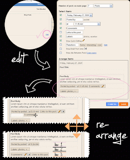
If this works for you, great!
But, lots of times, you CAN rearrange the elements by "dragging" them around, and they will seem to be rearranged, and when you go check your Blog - NOTHING has changed!
You can solve this with:

► with clearing your cache (if you're lucky)
► by manually rearranging the elements in HTML code

If you're ready, let's go visit the HTML of our template....
Before making any changes to your code, I suggest to back up the current Blogger layout. Then go to:
LAYOUT ► EDIT HTML ► click on Expand Widget Templates


Use the [CTRL] + F (or (EditFind from your browser's menu) and search for this line:
<div class='post-footer'>
Post-footer is divided in 3 lines, and each line has some elements in it(Labels, Comment Link, Posted by, Timestamp...) wrapped in a span.
<div class='post-footer'>
<div class='post-footer-line post-footer-line-1'>
<span class='post-author vcard'>
<b:if cond='data:top.showAuthor'>
<data:top.authorLabel/>
<span class='fn'><data:post.author/></span>
</b:if>
</span>

<span class='post-timestamp'>
<b:if cond='data:top.showTimestamp'>
<data:top.timestampLabel/>
<b:if cond='data:post.url'>
<a class='timestamp-link' expr:href='data:post.url' rel='bookmark' title='permanent link'><abbr class='published' expr:title='data:post.timestampISO8601'><data:post.timestamp/></abbr></a>
</b:if>
</b:if>
</span>

<span class='post-comment-link'>
<b:if cond='data:blog.pageType != &quot;item&quot;'>
<b:if cond='data:post.allowComments'>
<a class='comment-link' expr:href='data:post.addCommentUrl' expr:onclick='data:post.addCommentOnclick'><b:if cond='data:post.numComments == 1'>1 comment<b:else/><data:post.numComments/> comments</b:if></a>
</b:if>
</b:if>
</span>

</div>
...in orange, you can see how to identify the Post-footer line (in this example, 1st line)
...in pink you can see the code of Posted by, in green of Timestamp, and in blue of Comment Link

Notice how each element is wrapped in a span:
<span class='post-author vcard'>
<b:if cond='data:top.showAuthor'>
<data:top.authorLabel/>
<span class='fn'><data:post.author/></span>
</b:if>
</span>
...in orange, you can see the opening span and closing span
Span class identifies the element:
span class='post-author vcard' ► Posted By
span class='post-timestamp' ► Timestamp
span class='post-labels' ► Labels
span class='post-comment-link' ► Comment link
span class='post-backlinks ► Links to this post
span class='post-icons' ► Email this post icon and Quickedit icon
span class='reaction-buttons' ► Reactions
span class='star-ratings' ► Star ratings
span class='post-location' ► Post location

The whole idea of rearranging elements manually is a simple CUT and PASTE:
► CUT the code of the element you'd like to move
► PASTE it in the line you prefer

You need to cut the entire code of the element, meaning the whole Span. For example, if I want to move the Labels in the first line, I'll CUT the code representing Labels:
<span class='post-labels'>
<b:if cond='data:post.labels'>
<data:postLabelsLabel/>
<b:loop values='data:post.labels' var='label'>
<a expr:href='data:label.url' rel='tag'><data:label.name/></a><b:if cond='data:label.isLast != &quot;true&quot;'>,</b:if>
</b:loop>
</b:if>
</span>
...and PASTE in somewhere under the 1st Post footer line:
<div class='post-footer-line post-footer-line-1'>
...apply the same rule for other elements.


MOVE THE ELEMENT FROM POST FOOTER UNDER THE POST TITLE
Same way you rearranged the elements in Blogger post footer, you'll move them under your Post Title.For this example, I've chosen to place my Blog
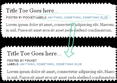
 Labels under the Post title.

1. First thing is to CUT the code of the element we'd like to move (Labels in my example):
<span class='post-labels'>
<b:if cond='data:post.labels'>
<data:postLabelsLabel/>
<b:loop values='data:post.labels' var='label'>
<a expr:href='data:label.url' rel='tag'><data:label.name/></a><b:if cond='data:label.isLast != &quot;true&quot;'>,</b:if>
</b:loop>
</b:if>
</span>
..the code you CUT needs to be wrapped in a Span (in orange) (DO NOT cut anything extra!)

2. PASTE your code into Notepad (Texedit)

3. Locate this line in your code:
<div class='post-header-line-1'/>
...and place your Labels code UNDER this line.
You will notice that the Labels are now in place, but without the default style. The reason this happened is because we've "ripped" the Labels from Post Footer, which has a defined style.

4. We have to create a style for the Labels element, and adjust it to fit. Add the code in orange around the Labels code:
<div class='under-title'>
<span class='post-labels'>
<b:if cond='data:post.labels'>
<data:postLabelsLabel/>
<b:loop values='data:post.labels' var='label'>
<a expr:href='data:label.url' rel='tag'><data:label.name/></a><b:if cond='data:label.isLast != &quot;true&quot;'>,</b:if>
</b:loop>
</b:if></span>
</div>
...we've just wrapped the Labels code in a "div" so we can manipulate with it better.

Next, copy this:
.under-title {
margin: 0 0 10px 0;
color:#000000;
text-transform:uppercase;
letter-spacing:0px;
font-family:arial;
font-size:10px;
}

And place in anywhere ABOVE this part:
]]></b:skin>
</head>
...in pink, you can adjust the margin of the element
...change the style (color, line-height, font) to whatever suits you..


MOVING MORE ELEMENTS UNDER POST TITLE
Now, this will be much easier. You just have to CUT the the code of the element (the entire span!), and place it in the "div", like so:
<div class='post-header-line-1'/>

<div class='under-title'>
<span class='post-author vcard'>
<b:if cond='data:top.showAuthor'>
<data:top.authorLabel/>
<span class='fn'><data:post.author/></span>
</b:if>
</span>

<span class='post-labels'>
<b:if cond='data:post.labels'>
<data:postLabelsLabel/>
<b:loop values='data:post.labels' var='label'>
<a expr:href='data:label.url' rel='tag'><data:label.name/></a><b:if cond='data:label.isLast != &quot;true&quot;'>,</b:if>
</b:loop>
</b:if></span>

</div>
..in orange, you can see the main div that defines the style for the whole container, and everything you place there, will automatically "pick up" the style...
..now, this will place everything in the same line. Hm. If this is to messy for you, you can place each element in it's own row.
All you have to do is change the word:
span into div

For example, the Labels code will look like this after the change:
<div class='post-labels'>
<b:if cond='data:post.labels'>
<data:postLabelsLabel/>
<b:loop values='data:post.labels' var='label'>
<a expr:href='data:label.url' rel='tag'><data:label.name/></a><b:if cond='data:label.isLast != &quot;true&quot;'>,</b:if>
</b:loop>
</b:if></div>
..in orange, you can see we changed span into div...

That's it. You can stylize, play, add icons, background.....anything.

Mengenai Saya

Postingan Populer