Smartphone revolution brings new features to the web development, it is time to change your website design into a responsive design instead of maintaining a separate mobile version . Responsive design will automatically adjust itself based on the screen size of the media devices. This post explain you how to use CSS 3 @media property and working with Internet Explorer using Modernizr.
 Download Script
  Live Demo
Try live demo with different screen resolutions.
Step 1
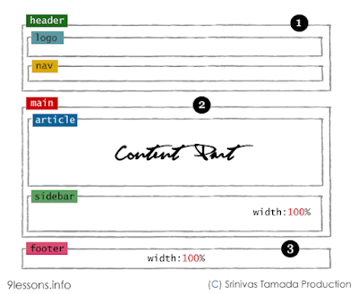
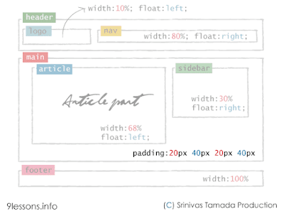
Web layout divided into three horizontal parts are Hearder, Main and Footer. Here Header div divided into two horizontal parts such as Logo and Nav and the same way Main div divided into Article and Sidebar.HTML Code
<div id="header">
1 Header
<div id="logo">logo</div>
<div id="nav">links</div>
</div>
<div id="main">
2 Main
<div id="article">article</div>
<div id="sidebar">sidebar</div>
</div>
<div id="footer">
3 Footer
</div>
1 Header
<div id="logo">logo</div>
<div id="nav">links</div>
</div>
<div id="main">
2 Main
<div id="article">article</div>
<div id="sidebar">sidebar</div>
</div>
<div id="footer">
3 Footer
</div>
This is very useful for web development.
Wireframe
CSS
*{margin:0px;padding:0px}
#header
{
padding:20px;
overflow:auto;
}
#main
{
padding:10px;
}
#footer
{
padding:20px;
clear:both
}
#article,#sidebar
{
min-height:250px;margin-bottom:20px;overflow:auto
}
#header
{
padding:20px;
overflow:auto;
}
#main
{
padding:10px;
}
#footer
{
padding:20px;
clear:both
}
#article,#sidebar
{
min-height:250px;margin-bottom:20px;overflow:auto
}
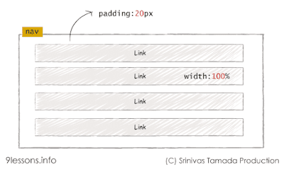
Step 2
Now working with an unorder list <ul> tag.
<div id="nav">
<ul>
<li>link</li>
<li>link</li>
<li>link</li>
....
....
</ul>
</div>
<ul>
<li>link</li>
<li>link</li>
<li>link</li>
....
....
</ul>
</div>
CSS
ul
{
list-style:none;
width:100%
}
li
{
padding:4px;
margin-bottom:5px;
background-color:#ffffcc;
text-align:center;
color:#00000
}
{
list-style:none;
width:100%
}
li
{
padding:4px;
margin-bottom:5px;
background-color:#ffffcc;
text-align:center;
color:#00000
}
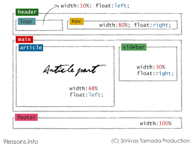
Step 3 - @media 768px
Working with screen media resolution minimum width at 768pxWireframe @media 768px
CSS @media 768px
@media only screen and (min-width: 768px){
#article
{
float:left;
width:68%;
}
#sidebar
{
float:right;
width:30%;
}
#logo
{
float:left;
width:10%;
}
#nav
{
float:right;
width:80%;
}
}
#article
{
float:left;
width:68%;
}
#sidebar
{
float:right;
width:30%;
}
#logo
{
float:left;
width:10%;
}
#nav
{
float:right;
width:80%;
}
}
Step 4 - @media 1140px
Working with screen media resolution minimum width at 1140pxWireframe @media 1140px
CSS @media 1140px
@media only screen and (min-width: 1140px) {
#main
{
padding:20px 40px 20px 40px;
}
}
#main
{
padding:20px 40px 20px 40px;
}
}
Step 5 - @media 480px
Working with Nav bar list media resolution minimum width at 480px. This is applicable for screen media resolution higher than 480px.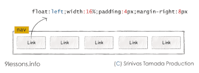
@media only screen and (min-width: 480px){
ul
{
float:left;
}
li
{
float:left;
width:16%;
padding:4px;
margin-right:8px
}
}
ul
{
float:left;
}
li
{
float:left;
width:16%;
padding:4px;
margin-right:8px
}
}
Modernizr
Modernizr is a JavaScript library that detects the availability of native implementations for next-generation Web Technologies. These technologies are new features that stem from the ongoing HTML5 and CSS3 specifications. 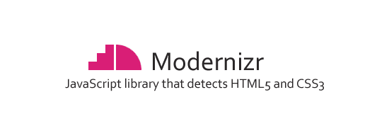
HTML Code
For implementing lower version browser like Internet Explorer 7 and 8, you just include modernizr.min.js after style sheet inside header tag. download link.
<!DOCTYPE html>
<!--[if lt IE 7]>
<html class="no-js lt-ie9 lt-ie8 lt-ie7">
<![endif]-->
<!--[if IE 7]>
<html class="no-js lt-ie9 lt-ie8">
<![endif]-->
<!--[if IE 8]>
<html class="no-js lt-ie9">
<![endif]-->
<!--[if gt IE 8]><!-->
<html class="no-js">
<!--<![endif]-->
<head>
<title>Responsive Design with CSS</title>
//Meta tag for devices
<meta name="viewport" content="width=device-width">
<link rel="stylesheet" href="style.css"> //Style Sheet
<script src="modernizr.min.js"></script>
</head>
<body>
<div id="header">
<div id="logo">Logo</div>
<div id="nav">
<ul>
<li>link</li>
<li>link</li>
<li>link</li>
<li>link</li>
<li>link</li>
</ul>
</div>
</div>
<div id="main">
<div id="article">Content Here</div>
<div id="sidebar">sidebar</div>
</div>
<div id="footer">
Footer
</div>
<body>
</html>
Now this code works fine with Internet Explorer lower version.
Note: Modernizer doesn't support inline CSS.
style.css
Final CSS
*{margin:0px;padding:0px}
#header
{
padding:20px;
overflow:auto;
}
#main
{
padding:10px;
}
#footer
{
padding:20px;
clear:both
}
#article,#sidebar
{
min-height:250px;margin-bottom:20px;overflow:auto
}
ul
{
list-style:none;
width:100%
}
li
{
padding:4px;
margin-bottom:5px;
background-color:#ffffcc;
text-align:center;
color:#00000
}
@media only screen and (min-width: 480px){
ul
{
float:left;
}
li
{
float:left;
width:16%;
padding:4px;
margin-right:8px
}
}
@media only screen and (min-width: 768px){
#article
{
float:left;
width:68%;
}
#sidebar
{
float:right;
width:30%;
}
#logo
{
float:left;
width:10%;
}
#nav
{
float:right;
width:80%;
}
}
@media only screen and (min-width: 1140px) {
#main
{
padding:20px 40px 20px 40px;
}
}
Note: Modernizer doesn't support inline CSS.
Credit


 ...I've also added some
  ....to avoid it, I'll hide the style in "main-wrapper" using /* and */....in the code it's like this:


 To avoid this, find the
 There are 4 steps to get this working:
 ...for example, if you
  You can change the border style in this part of CSS:
 You can also change the border
  To add a background color to your Footer, add this line to your #footer-columns in CSS:
 This is more fancy. You can make something like I've did for this tutorial, or place any kind of background you'd like (patterns, images, lines....).
 Always work in RGB mode, and export pics for web (or save as
  First, we have to add some style to the CSS of
  So, UNDER this part of code:
 We can do better. Let's start with adding 3 columns in the footer, and place the default one on the bottom.
 Advantages:
 We'll have to tweak the HTML code a bit. Until Blogger provides automated way of doing this....And I hope it will.
 Now, you have to find this part of the code:
 Before doing any customization, back up your template. Just in case....
 To add a background picture behind our
 ....well, that's about it. If you are interested in some more customization of Post Titles, or you want something else, read the article about placing icons in Post Titles.
 But there's a lot that can be done. We can give them some background color, even a picture, an icon beside them, borders, lines......
 To add some borders around your Sidebar Title, add the line (in
  To add some background color behind your Sidebar Title, add the line (in
  First you need to make (or find some picture you'd like to appear in title. You have to size it according to your Sidebar width (otherwise, it will get cropped).
 Now, this is a cool one. And my favorite. The idea is to
  ...that's it. Do the same for "Labels", "About me" and everything else you want.....
.jpg)


